Notes
Notes
Notes
Logo Design
Logo Design
Logo Design
Rebrand—A Logo Design for Hornet
Rebrand—A Logo Design for Hornet
Rebrand—A Logo Design for Hornet
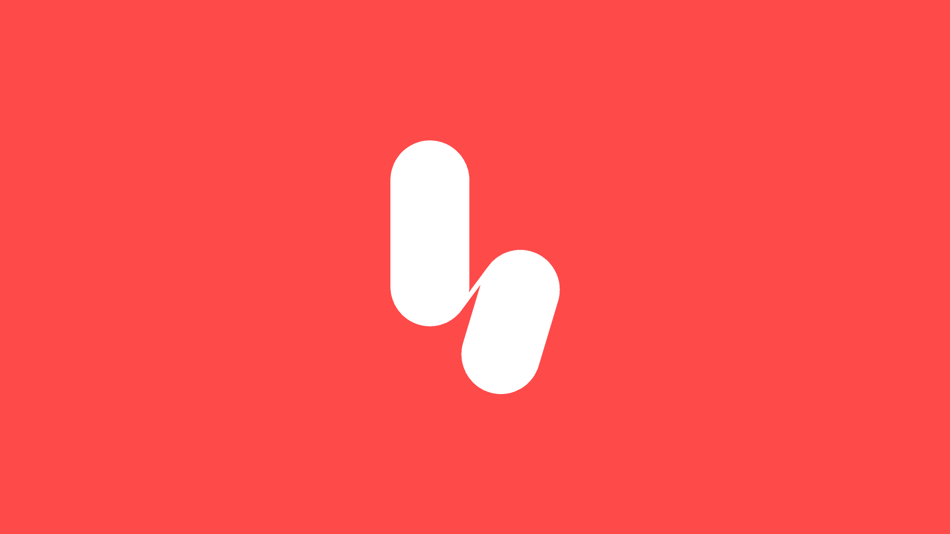
Part of the rebrand I was hired to design for Hornet included creating a new logo mark.
This involved 60+ variations in many directions, but I felt I was onto something when I imagined brush strokes painting a lower-case h. This would be two primary strokes, both downward, one vertical and one slightly at an angle—the way you would quickly scribble it with a fine-tipped brush.
Some variations of this featured slight horizontal points poking out of the top left or bottom right of the shapes—as if the brush had left a it when finished—but in the end we opted for a clean mark.
It took some iterations to get the visual balance right—and no complicated circle diagrams or golden ratios were used—just eyesight and how it feels with a lot of stepping back and head-tilting, as well as feedback and input from Daniel Fries (CD).
One cool thing about this particular design is it allowed for the use the shapes individually as design elements in other materials (such as capabilities decks) — for example by blowing them up and having them bleed off the page.
Creative Dir: Daniel Fries
Logo animation Instagram reel by Hornet
More notes